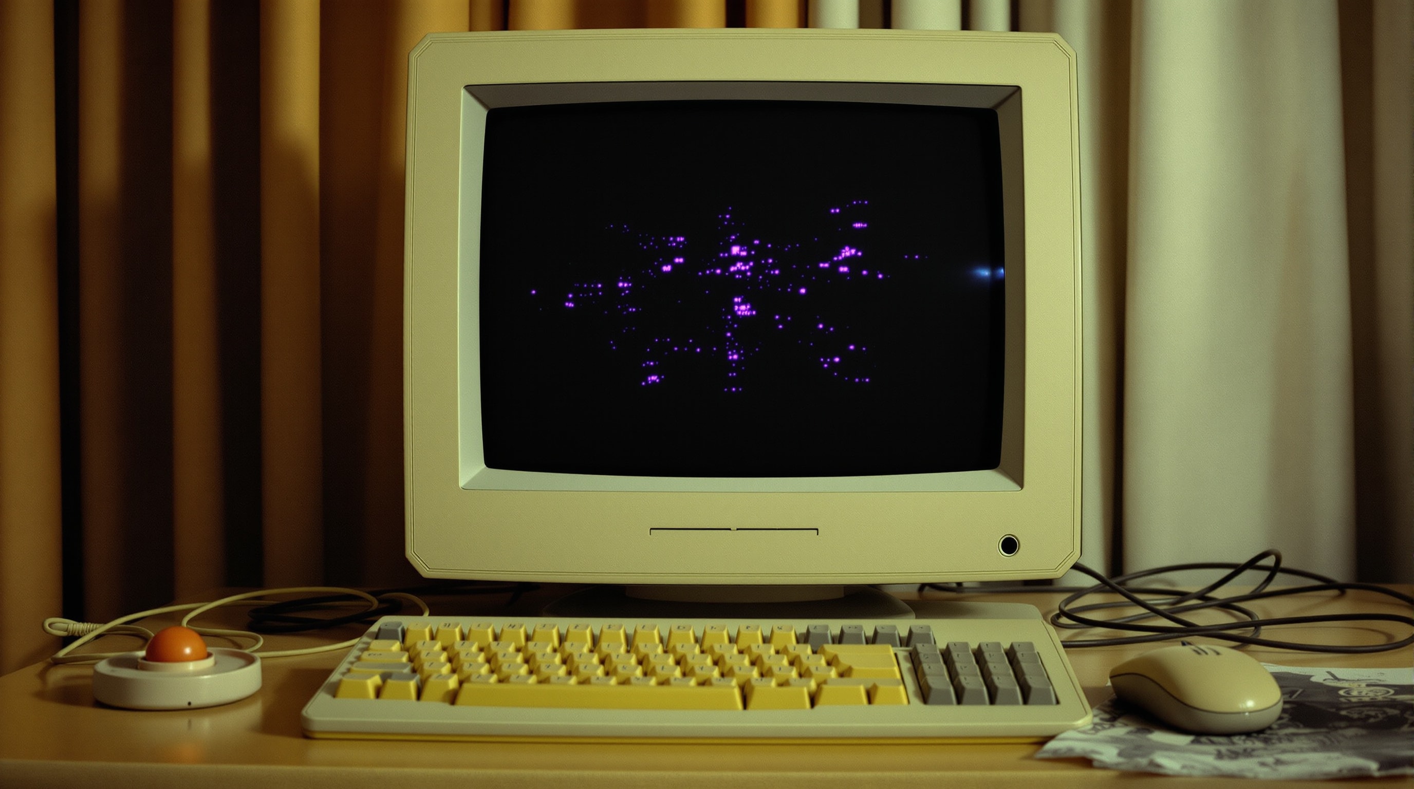
Open a captured collective homepage from 2007 in a modern browser and it will render, more or less, as a stack of misaligned images over a black background. What you are looking at is a document assembled by hand in a visual editor by someone who was primarily a cartoonist, targeting a single screen size, on a connection where every kilobyte was a decision. Almost every strange thing about these pages follows from those three facts.
The frameset years
The earliest layouts were framesets: a container document that split the browser window into independent panes, each loading its own HTML file. A typical comics site used three — a banner across the top, a navigation column down one side, and a main pane where the actual pages loaded. It solved a real problem elegantly. With no server-side includes and no templating, frames were the only way to change one region of a page without re-editing every file.
They also caused the era's first great linking disaster. A reader who arrived from a search engine landed inside the content pane alone, with no navigation and no way back. A reader who bookmarked a comic bookmarked the container, which always reloaded to the default page. And a reader who copied the address bar to share a specific page copied the frameset URL, which pointed at nothing in particular. Frames were deprecated and eventually removed from the standard for precisely these reasons, but by then a decade of comics archives had been built inside them.
The layer era
What replaced frames on hobby sites was not semantic HTML. It was absolute positioning. The dominant WYSIWYG HTML editor of the period offered a drawing-tool metaphor — drag a box onto the canvas, type in it, drag another box on top — and it wrote each box out as a div with explicit pixel coordinates and a stacking order.
A single homepage might contain ten such layers, each pinned to a coordinate that only made sense on the author's monitor. The result looked deliberate and was structurally inert: no flow, no reordering, no reflow at a different width. Narrow the window and the layers overlapped. Widen it and they clustered in the top-left corner of an ocean of background.
Navigation made of pictures
Text navigation was rare. Buttons were bitmap images, usually in pairs — an "off" state and an "on" state — swapped on hover by a small JavaScript function the editor generated automatically, along with a preload routine to stop the first hover flickering while the second image downloaded.
Some sites went further: hovering a menu item would swap a much larger banner image at the top of the page, so the banner acted as a live description strip. It was genuinely clever interaction design for 2006, and it left an archive with no readable navigation whatsoever. Every menu label was pixels. Search engines saw nothing; screen readers saw nothing unless someone had filled in the alternative text, which almost nobody did; and when a graphics directory later went missing, the entire site became an unnavigable blank. If you are trying to reconstruct a vanished site's structure today, the fastest route is usually not the pages but the directory listings in an archive crawl.
Designed for one screen
These sites were built for 1024×768 and they said so. It was common for a homepage to instruct visitors to switch to that resolution and press the key that hid the browser toolbars, in order to see the layout as intended. Content columns were pinned at 950 to 990 pixels because that was what fitted after scrollbars.
Comic pages themselves settled on a portrait image somewhere around 600 to 700 pixels wide and 800 to 900 tall — wide enough to read lettering, short enough to avoid a second scroll. That single constraint shaped the drawing: fewer panels per page, larger lettering, less detail in backgrounds, and a strong preference for vertical compositions. Print-native page layouts scanned down for the web read as cramped, and experienced creators of the period drew for the screen from the start.
The dial-up budget
Bandwidth was the binding constraint and everybody knew it. A page image was expected to land somewhere between 60 and 120 kilobytes; over a modem that is roughly ten to twenty seconds of waiting, per page, in an archive dive of forty pages. Sites said so openly, apologising for being image-heavy and promising to keep files optimised.
The practical craft was format selection, and the rules were the opposite of modern instincts. Line art with flat colour compressed far better as a palette-limited GIF or PNG than as a JPEG, which smeared grey artefacts around every ink line. Painted or airbrushed work went the other way. Getting this wrong doubled a file for no visible gain, and readers noticed. The MDN reference on image formats still describes the same trade-offs; only the numbers have changed.
Headings that were pictures
One last habit deserves its own note, because it did the most lasting damage. Section headings were routinely images — a title rendered in a decorative typeface, exported as a GIF, and dropped in where an h1 or h2 belonged. Web fonts did not exist, and the alternative was one of six system typefaces, so the choice was aesthetically reasonable.
The consequence is that a large fraction of these sites contain almost no machine-readable text at all. The comic is an image, the navigation is images, the headings are images, and the only real text on the page is a copyright line in the footer. That is why so little of this era is searchable, why the surviving descriptions of vanished strips come from third-party directories rather than the sites themselves, and why preservation here is much harder than for a text-based site of the same age. It also makes the URL structure the single richest surviving source of information about how a site was organised.